Maximise PowerPoint accessibility and ensure your presentation can be enjoyed by your entire audience.
Anyone can deliver a presentation, be presented to, or spectate as an audience member. But nobody’s experience of a presentation is the same. If we asked each and every person in the audience how they felt about the material, we’d get varying feedback. Perhaps someone struggled to see the text, maybe someone couldn’t quite make out what the speaker was saying, or maybe the images weren’t clear enough. The point is, it’s very likely that someone in the audience has some sort of disability that affects how they experience a presentation.
One in 30 people in the UK are blind or visually impaired. If companies overlook their needs, they’d be disenfranchising a significant proportion of their audience. But it’s not just visual disabilities that need to be considered: there’s the 1/6 people who have some form of hearing loss, the 15% of people who are dyslexic and the 1.5 million, or 1/44 people who have a learning disability.
These figures are hard to ignore. It’s down to presentation developers to make sure the material factors in a range of needs. Making sure that software is usable for all people, regardless of any disabilities they may have, should be at the top of the developer’s checklist of priorities. Inclusivity is incredibly important if you want your ideas to reach a big audience, but it’s swept to the side far too often. We’re here to share some simple ways you can maximise PowerPoint accessibility, making it easier for you to incorporate accessible functionality into your presentation build.
Making your text accessible in PowerPoint
Typically, people pick the font they like the look of: something that they themselves can read, and one that probably strikes a nice medium between pretty and professional. But not everyone considers whether the font they choose for their slides will be legible to people with visual impairments or dyslexia.
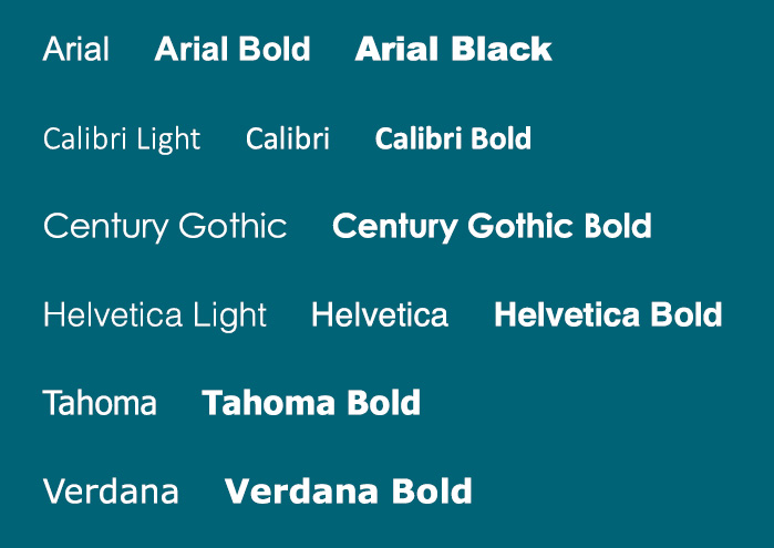
Generally, handwriting-style or serif fonts are on the harder-to-read side, because letter shapes are poorly defined and irregular. Some fonts like ‘Dyslexie’ or ‘OpenDyslexic’ have been specifically designed to facilitate the readability of those who struggle. Arial, Calibri, Century Gothic, Helvetica, Tahoma and Verdana are also strong choices for the conscientious presenter.
To maximise PowerPoint accessibility, follow these rules for your text:
- Use a small number of different fonts, ideally only one or two for headings and body text
- Make sure there’s enough colour contrast between the text and background
- Try to keep fonts above 11pt
- Use bold to add emphasis, rather than italics or UPPERCASE, but use it sparingly!
- Don’t use emphasis animations (the ones coded yellow under the “Animations” tab that involve excessive spinning or flashing on and off) on blocks of text because it can be distracting
- Avoid tight line spacing and kerning (maximise your white space!)
- Reduce the reading load for the audience (the less work they have to do, the better
Accessible colour choice in PowerPoint
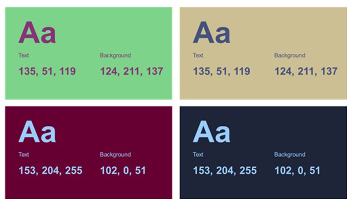
Colour is a powerful design tool: it evokes emotion, helps create a dynamic visual experience and can either captivate someone’s attention or make them want to look away. When it comes to colour selection for presentations, general design best practice comes into play. Some colour combos are just a straight-up no go and some are simpatico.
Even though some people are unable to distinguish between different colours, contrast and differences in shade will still usually be visible. But there are some colours that, when put together, are totally indistinguishable to people with the most common form of colour blindness, such as equal shades of red and green. This combo isn’t a good look anyway, so you probably won’t be gutted that you can’t use it, but we still want you to be mindful of how your colour choices will look to different people.
If you’re unsure about what images to go with, there are multiple Chrome extensions that can simulate different forms of colour-blindness, so you can get help with your PowerPoint accessibility and get a flavour of how your designs look to someone with a disability.
Live transcription and translation in PowerPoint
At some point in your presenting career, there’s a chance that some of your audience won’t speak the language of you or your slides. With the world shifting more towards online presentations, the chance you’ll be presenting to people who speak another language is only increased.
This nifty little tool allows you to display live subtitles of your speech directly onto the presentation, while you’re presenting. It supports over 60 languages and it’s an easy way to broaden the audience you can share your ideas with. It also helps audience members who are deaf or hard of hearing follow the presentation, and participate in the discussion. Here’s a lowdown of all the cool stuff it does:
- Customised speech recognition: Presenters have the option to customise the speech recognition engine to translate the slide vocabulary or any jargon, technical terms, product or place names, etc.
- Toggle subtitles on or off: During your presentation, you may want subtitles to appear or disappear depending on what you need. PowerPoint now offers the toggle feature meaning you can press the toggle button in the middle of your presentation or use the shortcut key J.
- Appearance options: You may wish to change the colour, position, font style or transparency of your subtitles to accommodate different environments and audience needs.
If you’re not sure how to get transcriptions and subtitles app going, follow these instructions:
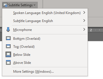
- Go to Slide Show > Subtitle Settings. From here you can change the spoken language, subtitle language, microphone settings, and where the subtitles appear.
- That’s it. Simple.
To change additional appearance settings for your subtitles, go to More Settings (Windows).
Now that we’ve covered the basics of PowerPoint accessibility and explained its importance, you’ll be better equipped to create a presentation that can be enjoyed by everyone. Presentations are there to bring joy and share knowledge to all people. It’s up to you to make this happen.

