PowerPoint has already chosen a font for you. That’s the problem.
Open a blank deck today and you’re in Aptos, the typeface Microsoft made the Office default in 2024 when it retired Calibri after seventeen years. It’s a perfectly good font. It is also, right now, the single most common typeface in every meeting room on earth, which makes it a strange thing to put your name underneath.
Here’s the thing nearly every font list gets wrong. They judge typefaces on a laptop screen, forty centimetres from your face, in a browser tab. Your slides don’t live there. They live on a screen at the far end of a room, four metres away, washed out by the lights nobody will turn off, read in about three seconds by someone deciding whether to keep listening to you. A font that’s a joy to read in a document can be useless in a room.
So this list is the ten best presentation fonts judged on that job: Aptos, Tahoma, Verdana, Georgia, Impact, Proxima Nova, Montserrat, Raleway, Lato and Inter. Below, what each one is actually for, which ones will survive being emailed to a client, and the two we’ve taken off this list since we first published it.
The 10 best presentation fonts, at a glance
| Font | Type | Availability | Best for |
| Aptos | Sans serif | Microsoft default | Body copy, when you have no other option |
| Tahoma | Sans serif | System font | Dense slides, tight spaces |
| Verdana | Sans serif | System font | Small text, bad projectors |
| Georgia | Serif | System font | Quotes, editorial titles |
| Impact | Sans serif, condensed | System font | One-word statements |
| Proxima Nova | Sans serif | Adobe Fonts | Whole-deck workhorse |
| Montserrat | Sans serif, geometric | Google Fonts | Titles with confidence |
| Raleway | Sans serif | Google Fonts | Titles and body from one family |
| Lato | Sans serif | Google Fonts | Body copy that stays quiet |
| Inter | Sans serif | Google Fonts | Screens, dashboards, numbers |
Most font advice is written for a document, not a room
The best font for a presentation is the one that stays readable at the back of the room, at speed, on a projector you haven’t tested. That’s the whole brief. Everything else is decoration.
This matters because most typographic advice you’ll find was written about text people hold in their hands or scroll on their phones. Readers there are close, patient and in control of the pace. Your audience is none of those things. They’re far away, they get one pass at every line, and the pace is yours.
Which flips a few of the usual rules. Delicate high-contrast serifs that look elegant in a report thin out and disappear on a projector. Tight letter spacing that reads as sophisticated on a website turns to mush at ten metres. Light and thin weights, the ones that look so clean in a design portfolio, vanish the moment the room isn’t dark.
Judge fonts on the job and the shortlist gets shorter fast.
Aptos is the default, which is exactly the problem
Aptos is a competent neutral sans serif designed by Steve Matteson, originally named Bierstadt after a Colorado mountain, and it replaced Calibri as Microsoft Office’s default in 2024. It’s readable, it’s well built, and it comes with a family that includes Aptos Display, Aptos Serif, Aptos Mono and Aptos Narrow.
It is also the typographic equivalent of turning up in the lanyard. Aptos was drawn to be a good default for documents, emails and spreadsheets, where the reader is close and neutrality is the point. On a slide in front of a boardroom, neutrality reads as “I didn’t choose this”. Your audience won’t be able to name the font. They’ll just register that the deck looks like every other deck they saw that month, because it does.
If you’re stuck with it, use Aptos Display for titles rather than plain Aptos. It’s cut for larger sizes and it holds up better on a big screen. And if you’ve got even ten minutes to spare, pick something else and get the free upgrade in perceived effort.
How to choose presentation fonts with a job in mind
Start with what the font has to do, not with what it looks like. Titles, body copy and data labels are three different jobs and one typeface rarely does all three brilliantly.
When to use a serif
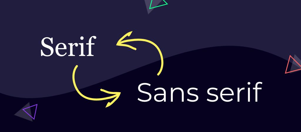
Serifs are the fonts with the little flourishes on the ends of the strokes, and they carry authority, tradition and a bit of editorial weight. Use them for titles, pull quotes and the occasional statement slide.
Don’t use them for body copy on slides. The details that make serifs lovely up close are the first thing a projector eats. Georgia is the exception worth knowing, because it was drawn for screens from the start.
Best serif picks: Georgia for anything shared, a licensed display serif for titles when the brand allows it.
When to use a sans serif
Sans serifs have no flourishes, which is precisely why they survive bad conditions. Simplified letterforms hold their shape across screen resolutions, projector quality and viewing distance. For nine decks out of ten, a sans serif is the correct answer for body copy.
Best sans serif picks: Proxima Nova, Lato or Inter for body, Montserrat or Impact for titles.
System fonts, cloud fonts and custom fonts
There are three tiers, and choosing the wrong one is how decks break.
System fonts ship with the operating system. Tahoma, Verdana, Georgia and Impact are on effectively every machine your deck will land on. Boring, and bulletproof.
Cloud fonts are the 700-odd typefaces Microsoft 365 downloads on demand for subscribers, Aptos among them. Fine when everyone in the chain is on a current Microsoft 365 or Office 2019 and later. Not fine when your client’s finance director is on something older, at which point your careful typography quietly becomes something else.
Custom fonts are everything you install yourself, from Google Fonts, Font Squirrel or Adobe Fonts. Best-looking option, most fragile. They need installing on every machine that opens the file, or embedding, which we’ll get to.
The 10 best presentation fonts in detail
Aptos
Microsoft’s Office default since 2024, designed by Steve Matteson. Neutral, legible, everywhere. Use Aptos Display for titles if you’re using it at all.
“I’m the one you get when you don’t decide.”
Tahoma
Matthew Carter designed Tahoma for Microsoft in 1994, with tighter letter spacing than its sibling Verdana. That tightness makes it useful when you’ve got more words on a slide than you should and no authority to cut them.
“I’m neutral. The Switzerland of fonts.”

Verdana
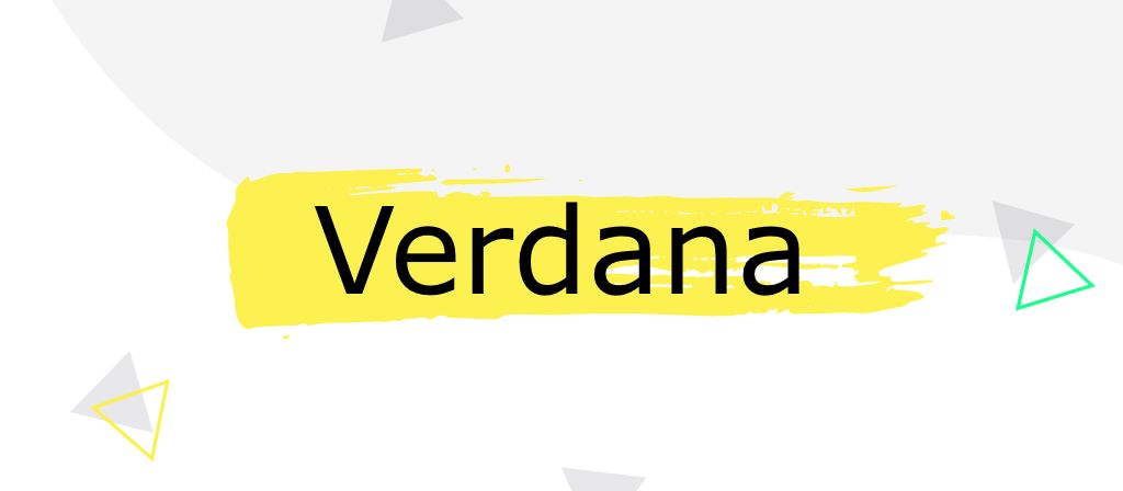
Also Carter, 1996, and drawn specifically for reading on screens at small sizes. Wide, generous letter spacing and open shapes make it one of the most forgiving fonts on this list when the projector is poor and the room is bright. It looks its age. It also refuses to fail.
“I’m not the prettiest, but I’ll never let you down.”
Georgia
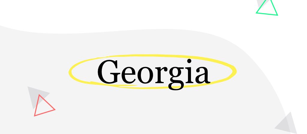
Carter again, and the reason this is his third entry is that he spent the 1990s solving exactly the problem you have. Georgia is a serif built for screens: sturdy, high legibility, proper contrast between weights. It’s the serif to use when you want gravity without risk.
“I’m a classic, and I’m not going anywhere.”
Impact
Geoffrey Lee drew Impact in 1965, and it does one thing with total commitment. Heavy, condensed, no subtlety available. Use it for a single word or a number on an otherwise empty slide. Use it for a paragraph and you’ve built a ransom note.
“Want to make a statement? Nothing about me is quiet.”

Proxima Nova
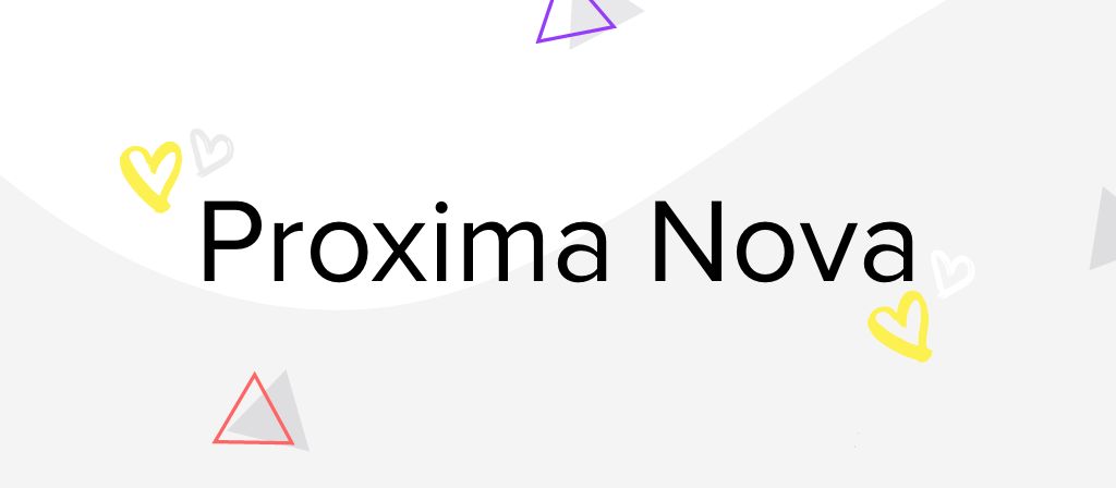
Mark Simonson’s Proxima Nova sits between geometric and humanist, which is a technical way of saying it looks modern without looking cold. It’s available through Adobe Fonts, it has enough weights to build a whole deck from one family, and it’s the closest thing on this list to a default that isn’t a default.
“I’m stunning, and I’m useful. Rare combination.”
Montserrat
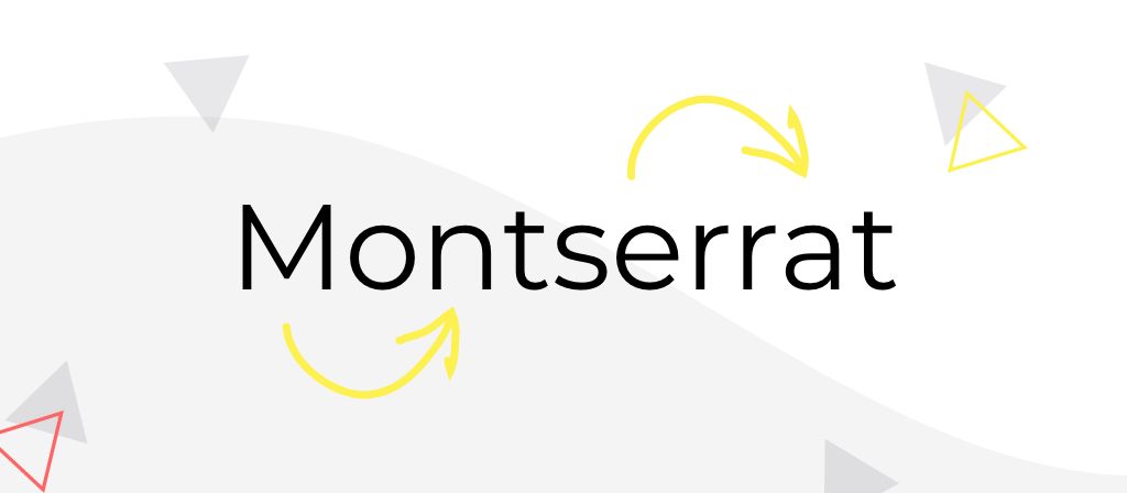
Julieta Ulanovsky drew Montserrat from the old painted signage of the Montserrat neighbourhood in Buenos Aires. Geometric, confident, free on Google Fonts. Superb for titles. Slightly wearing across a full slide of body copy, so pair it rather than pushing it.
“I’m a hipster classic and I know it.”
Raleway
Started life in 2010 as a single elegant thin weight from Matt McInerney, then expanded by Pablo Impallari and Rodrigo Fuenzalida into a family with real range. That range is the point: you can run titles and body from one typeface without the deck looking flat. Avoid the thin weights on a projector.
“I contain multitudes. Nine of them, in fact.”

Lato
Łukasz Dziedzic built Lato for a corporate client that later didn’t need it, then released it. It’s warm without being informal and it disappears politely behind your content, which is the highest compliment you can pay a body font.
“You’ll never notice me. That’s the job.”

Inter
The newcomer, and the reason two fonts left this list. Rasmus Andersson designed Inter for computer screens and user interfaces, with tall x-height, open apertures and genuinely excellent numerals. If your deck is full of figures, dashboards or data labels, Inter reads more cleanly at distance than anything else here. Free on Google Fonts, and available as a variable font.
“I was built for screens. Yours is a screen.”
Two fonts that were on this list in 2024 and aren’t any more
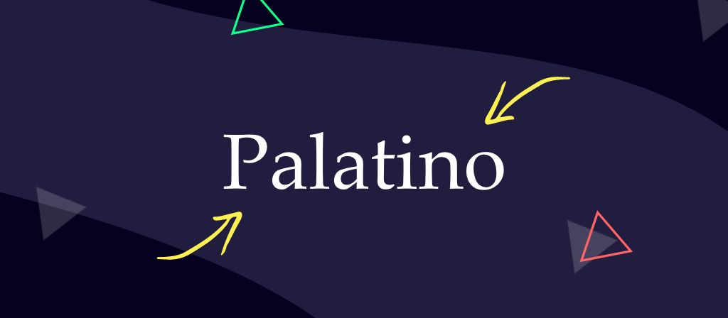
Palatino. Hermann Zapf’s 1949 serif is a beautiful piece of type design and it was drawn for print at a time when print was the only thing there was. On a projector, the contrast between its thick and thin strokes works against you. Georgia does the same job with none of the risk.
ITC Souvenir. It was having a moment when we last updated this post. The moment passed, as moments do, and a font that dates a deck to a particular year is a liability on anything you’ll present more than once.
Both are still perfectly good typefaces. Neither is a first choice for a room any more.
How to pair presentation fonts without starting a fight
Use two fonts. Three if you’ve got a genuine reason. More than three and they stop supporting each other and start competing.
The reliable formula is one font with personality for titles and one quiet font for everything else. Contrast is what makes a pairing look deliberate: if two fonts are only slightly different, the reader reads it as a mistake rather than a decision.
Pairings that hold up:
- Montserrat with Lato — the standard, for good reason
- Impact with Inter — maximum contrast, works for data-heavy decks
- Georgia with Proxima Nova — serif authority, sans serif clarity
- Raleway with Raleway — one family, two weights, when the brand demands restraint
Presentation fonts that break on someone else’s machine
The most common presentation font disaster isn’t a bad choice. It’s a good choice that didn’t travel. You build the deck in your custom brand font, you email it, and it opens on the client’s laptop in whatever the substitution gods decided, with every text box reflowed and your careful alignment in ruins.
Three ways out, in ascending order of effort.
Use a system font. Tahoma, Verdana, Georgia or Impact will render identically everywhere, forever, with no action from you. Unglamorous insurance.
Send a PDF. If nobody needs to edit it, this is the answer, and it takes four seconds.
Embed the fonts. Now available on Mac as well as Windows, which was not true when this post was first written.
Embedding fonts in PowerPoint on Windows and Mac
On Windows: File, Options, Save, then tick “Embed fonts in the file”. Choose “Embed only the characters used in the presentation” for a smaller file, or embed all characters if anyone else needs to edit it.
On Mac: the same option now exists in PowerPoint for Mac 2019 and later, and with a Microsoft 365 subscription, under PowerPoint, Settings, Save.
Two things to know before you rely on it. Embedding is all or nothing, so it takes every font in the file with it, including any you forgot were in there. And embedded fonts don’t always survive third-party file sharing or PowerPoint on the web, so test the actual delivery route before the actual day.
The licensing bit nobody reads
Not every font licence allows embedding. Some typefaces are marked as restricted and PowerPoint will refuse outright. Others allow it for viewing but not editing. Google Fonts are open licence and safe. Adobe Fonts have their own rules depending on your plan. A foundry font your brand bought in 2019 may cover print and web and say nothing at all about a client’s laptop.
If your deck is going to a client, an investor or a conference organiser, check the licence before you build. It’s ten minutes now against a rebuild later.
The typography rules that matter once the font is chosen
Size, and the three-second test
Body text on a slide should rarely go below 24pt, and titles should be a great deal larger. Guy Kawasaki’s 10/20/30 rule sets the floor at 30pt on the grounds that anything smaller means you’re reading your slides aloud, which he’s right about.
The practical check: stand back from your own monitor at roughly twice your normal distance and give each slide three seconds. Anything you can’t take in isn’t a font problem, it’s a word-count problem.
Alignment and line length
Left-aligned text is the easiest to read in English, because it gives your eye a clean edge to return to. Centred text works for a handful of words on a title slide and nowhere else. Justified text creates rivers of white space that make reading harder, particularly for dyslexic readers, and it has no place on a slide.
The optimum line length for presentation copy is around 50 characters. Longer and the eye loses its place on the return; shorter and the rhythm breaks up.
Bold, italic and the underline you don’t need
Bold works by exception. Bold one thing on a slide and it’s emphasis; bold six things and it’s wallpaper. Italics are for stress and for titles of works. Underlines are a hangover from typewriters and on a slide they mostly signal a hyperlink that isn’t there. Leave them alone and your bold does more work.
Widows and orphans
A widow is a single word stranded on its own line at the end of a paragraph. An orphan is a lone line pushed onto its own column or slide. Both make a slide look accidental. Fix them with a soft return (Shift and Enter) to reflow the text, or better, cut a word. There’s always a word.
Accessible presentation fonts
The most accessible presentation fonts are simple sans serifs at generous sizes with strong contrast against the background. Verdana, Lato, Inter and Tahoma all qualify.
WCAG doesn’t mandate a particular typeface, which surprises people. What it does mandate is contrast: 4.5:1 for normal text and 3:1 for large text, against the background behind it. That means pale grey body copy on a white slide fails regardless of how well chosen the font is.
Beyond contrast, the things that help most are the things that help everyone at the back of the room: bigger type, left alignment, no justified text, generous line spacing, and never setting anything important in all capitals, which strips out the word shapes people read by.
The font is the easy bit
Choosing a typeface takes ten minutes and it will make your deck look better. It won’t make anyone in the room care.
That’s the harder job, and it’s the one we do. We don’t build slides, we’re a presentation design agency that builds presentation experiences: the thing your audience actually walks out remembering, of which the font is roughly two per cent. Beautiful two per cent, mind.
If your deck reads fine and lands badly, the problem was never Aptos.
Presentation fonts FAQs
What is the best font for a PowerPoint presentation?
For most decks, a clean sans serif at 24pt or larger. Proxima Nova, Lato and Inter are the strongest all-round choices. If the file has to travel and render identically on any machine, use Verdana or Tahoma instead.
Is Aptos a good font for presentations?
Aptos is well made and readable, but it’s Microsoft Office’s default, so it carries no distinctiveness and signals no decision. It’s fine for body copy when you have no alternative. Use Aptos Display rather than plain Aptos for titles, as it’s cut for larger sizes.
What font size should presentation text be?
Body copy at 24pt minimum, and titles considerably larger. Guy Kawasaki’s 10/20/30 rule recommends a 30pt floor. If your text needs to be smaller than 24pt to fit, cut words rather than points.
How many fonts should you use in one presentation?
Two. Three at most, and only with a clear reason. One font with personality for titles, one quiet font for body copy.
How do you stop fonts changing when you send a PowerPoint?
Use a system font, send a PDF, or embed the fonts. Embedding works in PowerPoint on Windows and on Mac from PowerPoint 2019 onwards, but it’s all or nothing, and it doesn’t always survive third-party file sharing or PowerPoint for the web. Test the route you’ll actually send it by.
What are the most accessible fonts for presentations?
Simple sans serifs with open letterforms and a tall x-height: Verdana, Lato, Inter and Tahoma. Font choice matters less than contrast, though. WCAG requires 4.5:1 for normal text and 3:1 for large text.