Storytelling with data may seem like an impossible task. After all, you rarely see the quarterly financials pop up in the middle of a fairy tale, do you? However, if you want audiences to engage with your data, you need to wrap it up in a big, red narrative bow. Here’s our guide on getting storytelling with data right.
Look. There’s no time to tiptoe around the premise of this blog, so we’ll just come out and say it.
No one wants to look at your Excel spreadsheet.
We get it. You’re proud of all the hard work that went into gathering this data. But just because you like it, doesn’t mean anyone else wants to look at it. Didn’t your mother teach you anything?
If you want to make sure your audience understands the findings of your research – and they don’t just fall asleep the instant their eyeballs rest on your slide – you’ve got one more job to do. It’s time to switch over from science to storytelling.
Your audience won’t do your job for you
Numbers have an important story to tell. They rely on you to give them a clear and convincing voice.
Stephen Few, author and data visualisation expert
As the numbers guru, you’re responsible for uncovering insights that are vital to your company’s success. But it’s no use uncovering them at all, if the raw data doesn’t make sense to anyone but you. After all, you are incredibly smart. We mere mortals tend to need our numbers with a side of story, to help them go down smoother. This is where storytelling with data comes in.
If you just throw every data point up on the screen, you’re asking too much of your audience. You’re essentially asking them to do your work for you. And this is work you’ve already done, so it’s inefficient at best. Infuriating at worst. We wouldn’t write half a sentence and expect you to…
Data, coupled with a narrative, not only explains to your audience what the numbers mean to the business – and to them – but why it’s important for them to pay attention and take action.
The difference between storytelling with data and data visualisation
If you’re thinking:
Don’t worry Buffs, I click a button in PowerPoint and transform those pages of spreadsheet into a graph. I’ve been listening.
You
We need you to listen just a little harder. Yes, this is one step closer to digestible data, but it’s nowhere near storytelling with data.
Graphs and charts are just visual representations of your data and – while still important – you’ll see if you take a quick scroll down this page, that there is a lot more work to do before we get to talking about making your data pretty.
There’s a reason why children’s books start with the narrative and add the illustrations at the end. We need to figure out the big picture, the whole story, before we add visual flourishes. Your data needs to have purpose and passion before it has pictures.
Think about your audience
As with any good story, storytelling with data has nothing to do with you and everything to do with your audience. In an ideal world, you’d tell your data story to each stakeholder individually, tailoring it to push their – very specific – buttons. Oo er.
But who has that kind of time? Not you. You’ve got world-changing research to be doing.
We need to find the commonalities between each of your audience members and push their collective button instead. Before you start thinking about storytelling with data, get to know your audience through a mixture of face-to-face and Google-based research. Think about what keeps them up at night, what their dreams are, and what’s stopping them from getting there. Find out their current understanding of the matter at hand, and their relationship to the topic of your research.
It’s this understanding that will form the basis of your story. By identifying their emotional connection to your findings, you can pick the data that they will care about most. People often think that logic is the key to changing minds and behaviours, but even at the board level of the most serious brands in the world, the emotional brain has much more say in strategy.
Once you’ve got to know your audience, and found out what very personal goals connect them, don’t forget about the company. Make sure you know exactly where your research aligns with the greater business goals. If you can appeal to both their selfish motives and the company’s vision, you can’t fail.
Use all this new information to figure out what the big picture is. What do you want your audience to think, feel, and do once they’ve seen your presentation? Then, work backwards and create key messages that point them towards this conclusion, and pick out the stats that support.

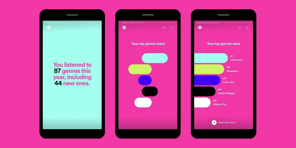
Storytelling with data example: Spotify
Most of us need to listen to the music to understand how beautiful it is. But often that’s how we present statistics: we just show the notes, we don’t play the music.
Hans Rosling
Just when you thought data couldn’t be cool: enter Spotify. In recent years, Spotify has been collecting all our listening stats and, instead of making us feel all weird about it, has boosted engagement with its annual recap stories.
Personalised to each Spotify customer, this lesson in infographic mastery is a stroke of marketing genius, and the talk of the Buffalo 7 studio every year. Whether yours forces you to remember that painful break up where you binged Adele for 234 hours, or gives you bragging rights for your great taste, Spotify has nailed it when it comes to tailoring data to suit the audience.
Your story is the star (your data is the support act)
Facts don’t persuade, feelings do. And stories are the best way to get at those feelings.
Philosopher, Tom Asacker
If we are going to appeal to that all-important emotional decision maker, there is no better way than by storytelling with your data. Your story is the vehicle that will carry all your insights into the brains of your audience. Your data then just seals the deal with logic and proof points.
Before you even open PowerPoint, you need to decide how you’re going to arrange your key messages, to make sure the audience reaches your pre-planned conclusion. The best way to do this is to mock up a storyboard.
Think of your storyboard as a flow chart, mapping out the narrative’s direction from start to finish. With your overall goal in mind, fill out this framework:
Start
Grab their attention by dangling a morsel of what’s to come, what the benefit will be to them, and why they should pay attention. We have a whole blog on how to start a presentation, if you need more guidance.
Set the scene
Establish common ground and get everyone on the same page by talking about the status quo in the business right now. Focus on the area you’ve been investigating, who it affects, what is happening, and how often.
Challenges
Pull out the core data that shows where the current challenges lie – and just how big a problem these are for each of your audience members, and the company as a whole.
The reveal
This is the eureka moment, where your audience realises exactly what is needed to turn this ship around. Suggest your solution, the benefits of implementing it, and the stats that show the potential in your idea.
To make this moment as impactful as possible, make sure to not only align your insights to each of the challenges in the previous section, but to the audience challenges and dreams as well.
Brighter future
If you have predictive or trend data that shows how much better off the company would be if it implemented your solution, make sure to include these here. However, you could just take what you know about your audience and describe how much closer they’ll be to their personal goals, if they listen to you.
Big bang
This final slide needs to outline concise recommendations that will lead the audience to your pre-planned conclusion. Don’t introduce any new ideas here. Simply recap your proposed solutions and benefits, and tell them exactly what you need them to do next to make this dream future a reality.
Ok, now you can open PowerPoint
Once you have your narrative arc, and you’ve supported each key point with only the relevant data, click that PowerPoint icon on your desktop.
You know the overarching messages that sum up each of the chapters of your story by now, but before you start writing a full script, here’s one last storytelling tip for you: write your headlines. For each slide, write a headline that sums up the one idea on that slide, reflecting the flow of your storyboard. What’s the most significant message for that slide? Make sure it comes across in the headline. This will guarantee that your big ideas are understood, slide by slide.
Only then should you start adding stats to the body copy and detail to the speaker notes.

Pick the best and discard the rest
One of the most important parts of telling any story lies in the editing. Storytelling with data is no different.
For every piece of data you think you want to display, ask yourself if it supports and advances the story you’re trying to tell. Then, ask if it supports and advances your audience’s selfish stories as well. If it doesn’t meet the criteria, ditch it.
The more concise you can get with your data, the more likely your audience will understand it, and care about it. Be scrupulous. Be selective. Take your ego out of the equation and just think about the audience. Keep editing until every piece of data left supports your key messages and the big picture.
And don’t worry about the data that doesn’t make the cut. Your hard work wasn’t for nothing. Someone, somewhere along the line, will probably challenge you to show your workings or explain how you reached a specific number. This is where your hidden appendix slides spring into action. You can keep your full data sets hidden at the back of your deck, accessible by button, for when these detail lovers come a-calling. One click and you establish instant credibility. And they’ll probably wish they never asked.
If possible, test your data story out on a representative audience, to see if it’s easy to understand. Ask them to repeat the key messages back to you. If they can’t, you still have some more editing to do.
Storytelling with data example: Fitbit
We’re not sure exactly when everyone in the world became obsessed with how many steps they do over the course of a day, or what their ‘sleep score’ is, but personal fitness trackers give us easy access to this information. Fitbit increases the relevance of this data by turning activity into a game. With a community element, badges, and trophies, keeping fit has never been so much fun.
Not only does Fitbit put the headline stats up front and keep the detail hidden – to be discovered by the real fanatics – but it makes the data relevant by putting it in the context of well-known landmasses or flights of stairs in landmark buildings, etc. By creating these references points, Fitbit instantly puts the user’s achievement into context. We can do the same when we’re storytelling with data in our presentations too.

Looks are important
Finally, the bit we’ve all been waiting for: the data makeover. Not only is data in isolation visually unappealing, but thwacking numbers onto a slide in a haphazard fashion is never the optimum way to support your hard-crafted narrative.
Great data visualisation can help you to tell your story, taking some of the weight off your shoulders. Design can make data easier to understand, enlightening your audience without you having to say any extra words. And it just makes it nicer to look at, so your audience will be more willing to take in what you – and your visuals – have to say.
Here are some of the biggest considerations when it comes to data visualisation:
Colours
Try to stick to two or three colours across your presentation and use your colours consistently. If you need more than just three colours to differentiate between data, first think if you can strip that data back any further, then consider using opacities of just one of your chosen colours for a subtle distinction. You can find these in your colour drop down,-underneath the first row of colours. And whatever you do, don’t use the PowerPoint Standard Colours. It’s unlikely they’re part of your brand, and – frankly – they’re just ugly.
Use colour sparingly, as a bright, contrasting, or unexpected colour will draw the eye, so you should use these to highlight the most important data.
Colours translate meaning, so think about your chosen colours and the attached connotations. But don’t only rely on colour to convey meaning, as different colours have different meanings to different people. And some people in your audience may not be able to see your carefully-chosen colours at all. Before you present, test your slides by removing the colour to see if the meaning is still coming through loud and clear.
Noise
Just as with your spoken story, your visual story will benefit from heavy editing. Too many elements on a slide will confuse the eye, so keep your visuals simple and make sure you use size, motion, or contrast to pull out the key message. When it comes to graphs and charts, we recommend removing the title and guides, and definitely steer clear of outlines and shadows.
Break heavy information across multiple slides, or animation stages, to make sure your audience understands one point before you move to the next. This is a great way to show a full graph or chart, but split to make sure the audience isn’t overwhelmed by all the numbers, all at once.
Growth
If your data shows any kind of increase, you can use graphical elements that are animated to scale up in size, making the key message of growth clear in an instant.
Call outs
If you can distil all those pages of data down to just one overarching metric, you’ve achieved presentation gold. If you don’t need to show a full chart, then don’t. Big punchy text and simple shapes to hold the stat is often all you need.
But, if you do need to show the whole chart, you can still use this design trick to draw the eye to the part of the chart that holds the important message, and spell it out for them with the call out. It’s not patronising, it’s time saving.
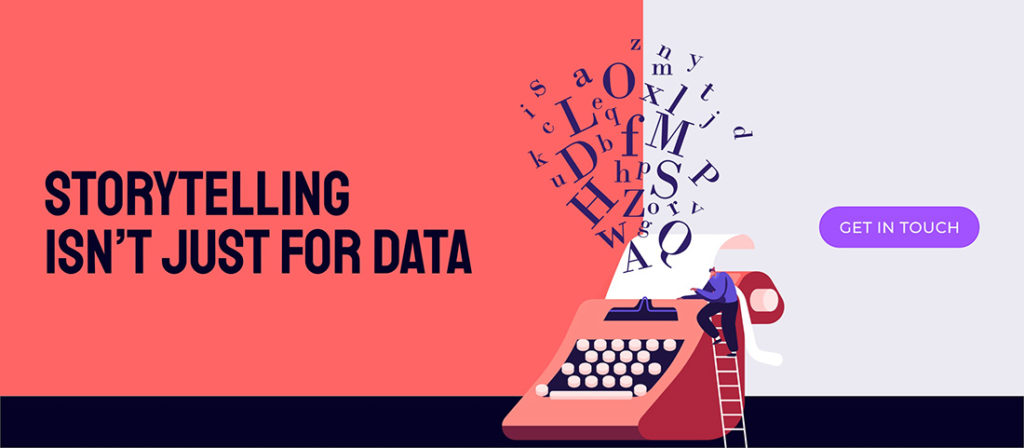
Storytelling isn’t just for data
When you combine the right visuals and story with insightful data, you can tell a data story that will influence any room. Don’t let your data down, package it in a beautiful narrative and make sure all your hard work is worth it, influencing business strategy and leading to positive changes in your company.
To learn more about storytelling for any presentation, download our free eBook [LINK], or get in touch to let our expert presentation designers get their grubby mitts on your numbers.