Presentation design trends can be incorporated into your slide deck in a number of ways. Even if they don’t fit your brand identity, subtle suggestions of a trend can show your audience you have your finger on the pulse. Let people know you’re an innovative, forward-thinking brand by blending 2022 graphic design trends into your presentation.
When we think of trends, most of us think of the fashion industry. Staying at the forefront of emerging styles is just part of the fabric of this fast-moving, competitive market. However, in graphic design, as in fashion, being on trend is everything. Graphic designers that stay up to date have a significant advantage. By offering clients innovative ideas, they can make sure they stand out. And by constantly updating their design repertoire and melding evolving trends with their own person style, great graphic designers guarantee their own continuing relevance.
At Buffalo 7, we are always refreshing our sources of inspiration. We push ourselves to leave our comfort zones. And we consume as much external graphic design as we can fit in our eye holes. Our clients need to stand out in order to leave a lasting impression. By integrating graphic design trends with their brand styles, we ensure their presentations, webinars, and screen shares blow the competition out of the water.
In this article, we’re going to take a look at 5 trends that look set to be huge in 2022, as identified by Shutterstock. And we’ll provide some ideas as to how these can be translated into presentation design trends for your next big pitch.
Design trends
- Movement
- More is more
- Natural beauty
- 90s vibes
- The One design style
Presentation design trend one: Movement
Motion and animation have become such important elements of the online experience that anything less is effectively a missed opportunity.
Shutterstock
When it comes to digital design, motion helps to stop the user’s endless scroll. It grabs their attention within that short millisecond window, and encourages engagement. But presentations don’t tend to have the same level of competition. Or do they?
Of course, there’s not usually a constant rotation of presentations vying for their attention. However, your audience will have a continuous influx of distractions that could pull them away from your key message. In a traditional presentation setting, your slides need to be more interesting than looking at their phones, or the thoughts racing around their heads.
And, in our remote world, the pressure is even higher. You’re competing with their to-do list, chores, and email notifications. You’re up against screaming babies, and streaming services. So many things tempting them to click the x in the corner of your webinar and do something else.
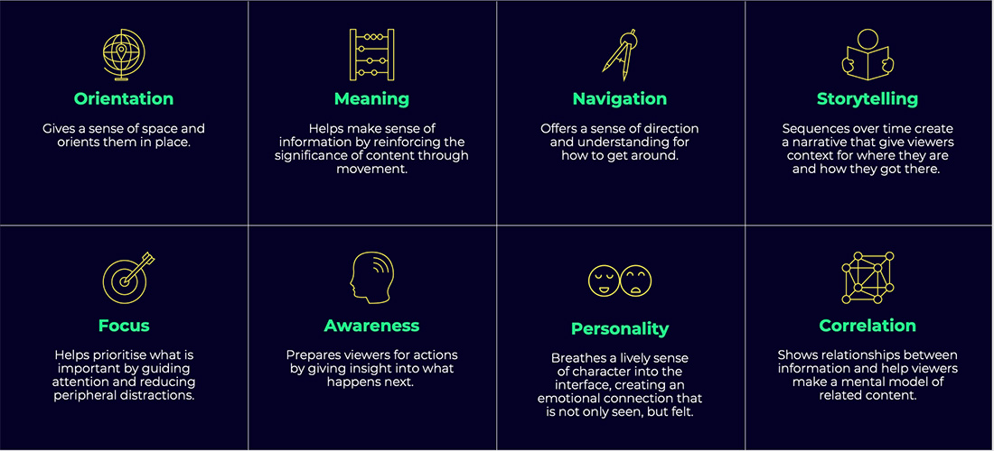
How does animation help?
Your story and your design both play a part in making sure your presentation wins this battle for attention. But well-thought-out motion can be an instant win. Animation flips the mind into entertainment-mode so, naturally, attention and retention increase. This is well-known in the UX world, but not so much in the world of presentations. Which now means you have the edge.
Adding animation to your presentations is great place to start dipping your toe into trends. No matter your brand identity, you can incorporate movement into your presentations to great effect. Shutterstock’s advice to ‘build a language of movement’ should extend to your presentations, increasing consistency across every communication. Basically, expect to see this presentation design trend sticking around as it doesn’t just look good, but serves a vital purpose as well.
Add purpose to your presentation animation
For animation to do its job, it has to be functional and nice to look at. It should be so smooth that the stream of information to your audience is uninterrupted. The best functional animations are often the ones the viewer barely notices. They just accept them as fact because they feel natural and central to the design.
In the UX world, designers have to justify why they are animating. Asking what the purpose of the animation is, or what you want a movement to achieve, will help you maximise engagement.
Here are some reasons you may need to animate an object:
Our top tips for getting presentation movement right
Animate with a clear hierarchy and mindful timing
Continuous momentum helps guide the audience’s attention where it’s needed most. A good sequence helps users understand what has changed on a screen, drawing focus to the most important messages. Highest priority elements should animate first, followed by lower priority elements.
Elements should move decisively, efficiently, and with purpose
Align to the grid. Snap into place. Use momentum to instigate crisp transitions. While no single detail will be immediately noticeable, this precision and attention to detail is palpable and felt, when applied holistically. A clear intent and precise movements communicate purpose, feel reliable, and add a sense of validity to the design.
Avoid pointless motion
Not everything on your slide needs to be animated. Referring back to that purpose should help you work out what to move, and what needs to stay put.
Make broad, consistent choices
Consistent animations reward the viewer’s expectations and avoid misinterpretation. They also help demonstrate the role and function of abstract elements.
Consistency also defines a baseline of behaviour against which abrupt changes and influences become more noticeable. Setting expectations and, in some cases, breaking them is a great way to add personality and intrigue to your slides.
Presentation design trend two: More is more
Messier, more chaotic, more saturated design will undoubtedly take on new bravado in 2022, as the younger generation looks to rework the world in its image.
Shutterstock
We’re currently watching a slow, and not entirely smooth, passing of the influential baton. Gen Z is making its case to take the reins. And the design world has already, happily, fallen in line.
But what does Gen Z design look like? Centre partings and mom fit jeans?
Yes. Well, that and a heck of a lot more. In 2022, be prepared to say goodbye to organisation and hello to – what looks like – chaos.
Minimalism is out. Monochrome chic will be a distant memory. And we’ll all be looking at a lot more jarring compositions, neon colours, and a more-is-more approach to aesthetics.
This can be a tricky trend to get right. When it comes to translating this idea into a presentation design trend, we’d advise erring on the side of caution. As a presenter, you want to be able to direct the audience’s focus through design. Your top priority should be making sure your messaging isn’t getting lost in your slide design. Which becomes a lot harder when your slide design looks like a teenager’s bedroom. Getting this trend right is more about creating the illusion of excess, while still controlling audience focus.
Contrasting busy elements with white space
You can create a happy balance of trendy and functional by focusing all your carefully-chosen chaotic elements in one area of your slide. This will leave a good amount of blank space and avoid audience overload. This balancing act between negative space and content will create contrast, and leave you, as designer, in control of your audience’s focus.
Create emphasis through motion
As well as disruption in patterns and contrasting colours, the human eye prioritises movement. Just think about the last time you were outside at night. With everything plunged into darkness, it’s hard to know where to look. However, when something moves in your peripherals, your eye darts instinctively in that direction.
You can apply this same idea to your Gen Z-inspired excessive slide design. Of course, with PowerPoint you have the luxury of animation, as discussed above, but you can achieve motion in other ways. For example, the eye will naturally scan in the direction you read, unless there is a powerful pull in the other direction. You can create this pull by adding directional cues, like an arrow or sharp, pointed object. Alternatively, try using photography where the subject is looking in a certain direction, and your audience will naturally follow their eyeline. Then, simply, put your key messages in this space.
Presentation design trend three: Natural beauty
Expect to see a focus on biodegradability, non-permanent inks and finishes, and a shift from self-indulgence, selfies, and perfectly preened design, to a more community-based approach to visuals, aesthetics, and motifs.
Shutterstock
Environmental concerns are on everyone’s minds, and the design world is trending to mirror this. In stark contrast to the Gen Z trend, many influential designers will be looking to reduce their impact on the planet. While much of the focus is on physical print design, it’s not the whole story. Digital designers are decreasing digital effort and, therefore, carbon load. This means you can still do your part, if presentations are more prominent than print in your world.
Planet-friendly presentations
First and foremost, consider if you even need slides at all. Gasp. I know. A presentation design agency suggesting slides might be surplus? The world is more turned around than we thought.
Yes, we’re damn good at creating slides, but it’s not our raison d’être. Our purpose on this – hopefully still green – earth is to harness the chaotic energy of a raw idea and transform how the world experiences it. Not a single mention of PowerPoint, presentations, or slide decks in that.
The truth is, not every presentation, or presenter, needs slides. Think about how complicated your story is. How comfortable you are presenting. And who’s going to be in your audience. If you can still tell a compelling story, you can ditch the digital accompaniment altogether.
If you can’t, keep them minimal instead. Minimal slide count. Minimal design elements. Minimal animation. This will reduce how much energy your machine needs to use, both during the build process and each subsequent outing.
Or, if that doesn’t fit with your brand identity, could you offset the damage in another way? Plant a tree for every presentation? Look to reduce your operational impact elsewhere? Obviously, you’re doing this for the good of the planet, but you may also find you increase brand loyalty and find new ways to connect with your audience – values to values.
Presentation design trend four: 90s vibes
Driven by the aesthetic preferences of Gen Z, ’90s tropes are back with a bang, and will undoubtedly define how this new interest in typography develops.
Shutterstock
Every year we see new typography trends coming through because it’s such a vast and ever-evolving area of design. But this year, it’s both evolving and devolving at the same time. We’re taking it back to the nineties.
Nostalgia design uses the familiarity of the old to sell the innovation of the new. This trend can be used as a powerful psychological tool. Give your older audience members those warm, fuzzy, comforting feelings associated with their glory days. And the younger people in your audience will love the ‘retro’ feel. They probably don’t even know what tamagotchis are, or what makes a prince so fresh. Your slides might be about to blow their minds.
90s typography
Type is going to play a big part in this trend. Shutterstock predicts the rise of both custom fonts and serif typefaces.
Serifs are the small features found at the end of strokes in some font families. You know, the fonts with the extra little fancy bits.
This isn’t just a decorative flourish. Serifs are used to guide the horizontal flow of the eye across the page. When used for slide body copy, serifs increase the contrast and spacing between letters, improving identification, increasing legibility, and reducing eye fatigue. Serifs can also represent a subtle and sophisticated side of your brand personality.
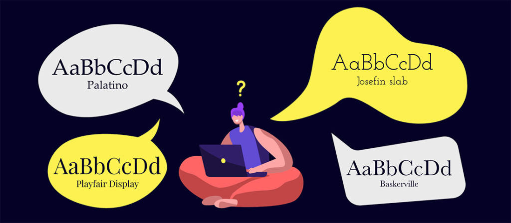
Some of our favourite serifs to add to your presentations include:
- Palatino
- Baskerville
- Bookman old style
- Playfair Display
- Josefin slab
- Gabriela
Not sure which font represents your brand personality? Take part in our font dating show, What’s your type?, and find your perfect match.
Some tips for working with serifs
Be careful not to take your font size too small. Those little lines can merge together, becoming impossible to read. Consider using a sans serif font for body copy, as it’s often easier to read at smaller sizes, but use a serif to bring out your key messages, or for titles and key statements.
Can I go custom?
When considering paying out for a custom font that is unmistakably yours, make sure to include presentations in the discussion.
For many years, we’d advise clients against using custom fonts in their PowerPoints. Historically it meant pre-installing that font on every machine the presentation was to be viewed, presented, or edited on. What a faff. But now, many fonts can be embedded into the slides. This means they stay put, no matter where your presentation finds itself. However, it’s not every font. So, it’s always good to do a dry run before making the commitment.
If you want to dive into this typography trend in more detail, Creative Boom has an article dedicated to the next big thing in type.
Presentation design trend five: The One design style
Expect a fairly obvious slant towards cyberpunk motifs and styles, as brands hope to leverage the goodwill created in and around the release of [The Matrix] film.
Shutterstock
In 2021, Facebook announced the metaverse and some big plans to turn the internet into a fully-immersive experience. Then The Matrix Resurrections inspired a new generation with its unique style. The next logical step is cyberpunk inspiration creeping its way into your presentations, right?
Well, no. Unless you fancy a complete rebrand that’s unlikely to stand the test of time. Or you already happen to have this very specific design style at the heart of your visual identity. But, if you think outside the box, you can still jump on this particular bandwagon.
Immersive presentation experiences

At Buffalo 7, we turn ordinary presentations into inspiring, engaging experiences, every day. And a big part of that is thinking of different ways to immerse audiences into our clients’ messages. To make them not just hear it and see it, but feel it as well. If you can combine storytelling, design, and motion to drop your audience into your story, give them the reins to explore your narrative, and let them find their own way to your solution, you’ll find your win rate increases exponentially.
There are simple tricks to doing this. You could turn your content into a game. Try breaking your monologue up with regular elements of interactivity. Or create such an intuitive menu system that anywhere your audience wants the conversation to go, you and your slides can easily follow. But the real impact comes from assessing each audience and each presentation purpose individually, and designing the experience around this discovery. And if you want to talk more about that, please do get in touch.
A final word of caution
Brand consistency should always come before anything else. If these trends don’t work with your brand identity, don’t try to crowbar them in just for a few minutes of looking cool.
However, you can still show your potential clients that you’re a forward-thinking brand with your finger on the pulse by working with the experts to incorporate a presentation design trend or two. The talented presentation designers at Buffalo 7 love to stay ahead of emerging trends, revelling in the challenge of creating the perfect balance between established client branding and exciting new design developments. Whatever the next big trend, our ultimate goal is always to create engaging, inspiring presentations that position our clients as innovators in their field.

