Welcome to our new presentation font dating show: What’s your type? Hosted by your favourite presentation design agency, Buffalo 7. Starting with ten eligible font choices, you’ll get to know your future font intimately. Based on purpose and personality, you’ll whittle the list down before making your final decision and running off into the sunset with the font of your dreams.
With over 600,000 fonts on What Font Is alone, the term choice paralysis doesn’t quite cover the sweat-inducing panic that accompanies picking just one font for your PowerPoint presentation. How do you even begin to narrow them down and find the best font for your needs? Do you choose based on the name you like most? Perhaps you simply keep returning to your ex font, even though you two clearly have communication issues? Or maybe you just close your eyes and see which your mouse lands on?
Why isn’t there a tinder for fonts?
You obviously can’t be trusted to make this decision on your own. Which is why we’ve done the legwork for you, rounding up ten beautiful, brilliant, and personality-packed font choices for you to choose from.
Enough of the build up.
10 best fonts for presentations
Shall we meet them?
1. Tahoma

Designed by Matthew Carter, Tahoma is one of Microsoft’s most popular sans serif typefaces.
2. Verdana
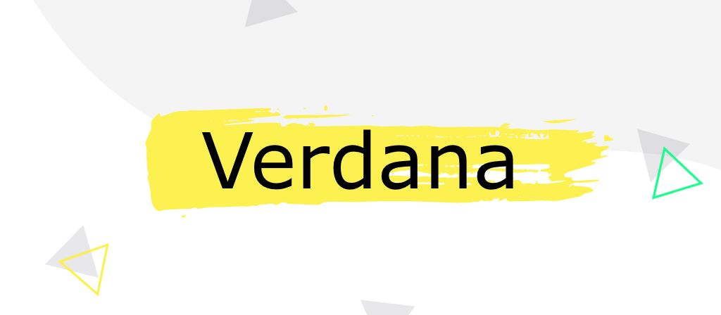
Another of Matthew Carter’s designs, Verdana is a prime example of a font created specifically for the screen.
3. Impact

Impact gets about a bit. Named as one of the core fonts for the web, this font has been seen by just about everyone.
4. Georgia
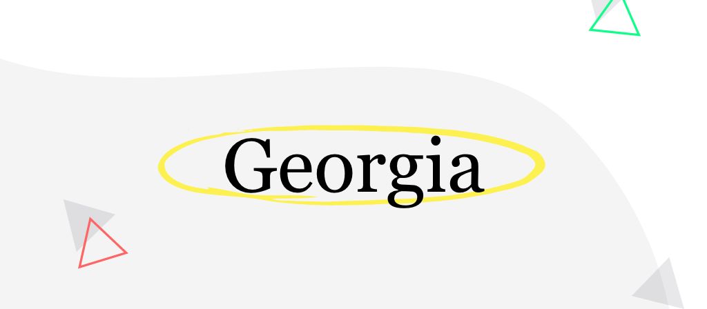
Georgia is a nineties gal. Designed for screen, Georgia’s weight fluctuates by a whole pixel, which is greater than traditional print typography.
5. Palatino

Palatino was originally designed for headings and is legible even on the inferior paper of the post-World War II period.
6. Proxima Nova
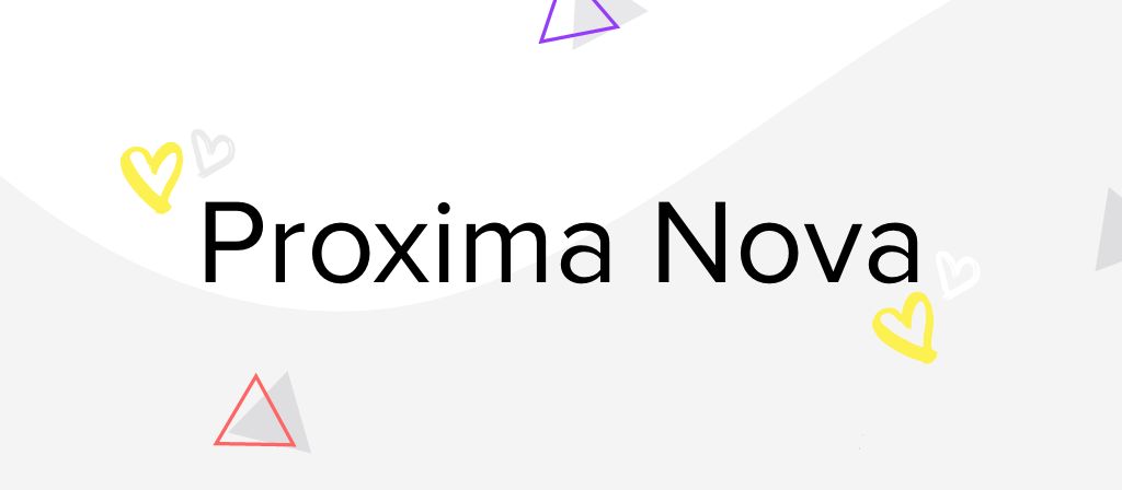
Proxima Nova is the go-to font for just about anything. Oh, it’s flexible alright.
7. ITC Souvenir

This personable little number gets along with loads of other fonts, just ask Futura and Roboto.
8. Montserrat
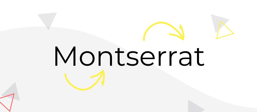
A Buenos Aires export, old posters and signs in the artist’s hometown inspired the creation of this 30-year old stunner.
9. Raleway

Initially created by Matt McInerney as a single-weight font, but my, my, has Raleway come a long way since then.
10. Lato

Lato was originally betrothed to a large corporate client, but they decided to go in another direction, so now it’s back on the public market, and looking for Mr Right.
The best font for your PowerPoint presentation is somewhere in this selection, just waiting for you to choose it. How does that feel?
Well, I’m excited. Let’s get cut-throat and start removing the fonts that just aren’t right for you.
Round one: Finding a presentation font with purpose
Fonts are much more than a pretty (type)face to look good sitting on your PowerPoint slide. They have strengths and weaknesses, just like any of us. In order to choose your perfect font, you first need to decide which one fits your purpose. All relationships are chosen based on practicalities, right?
Do you want a simple life, or something a little extra?
Understanding your ultimate goal isn’t just important when it comes to writing your story. The final deliverable, audience, and even the room layout all need to be taken into account when choosing your font. After all, if they can’t read your message, what’s the likelihood they’re going to remember it?

There are two main font categories for you to decide between: serifs and sans serifs. There are others, such as script and stencil, but we’re trying to keep this simple. Both serifs and sans serifs have their own benefits and specified use cases, making it easy to find the right font category for your need. Let’s start with serifs.
Could a sophisticated serif be the best font for your presentation?
Serifs are the little extra flourishes that sit at the ends of the larger strokes. They likely came about because the Romans would first paint the outlines onto stone before carving, and the paint brushes would create flares at the ends. Serif fonts more closely represent handwriting and, therefore, are universally acknowledged to be easier to read in print. The serifs create joins between letters, similar to how we’re taught to write in school.
Traditionalists will tell you that serif fonts should only be used for print, but we say that’s nonsense. In fact, serifs have made a huge comeback, have taken over the web, and are in some damn trendy presentations.
We don’t recommend using serif fonts for body copy, as they aren’t always the clearest, but for titles, or as a supporting font, they can work nicely to liven up your slides, while delivering that touch of class some of you might be looking for.
If you strip your slides right back to just powerful key statements, you want to draw the eye to the title, or your PowerPoint is destined to be printed, congratulations, you’ve just narrowed down your choices.
Our sassy serifs are:
- ITC Souvenir
- Georgia
- Palatino
Certain about serifs? Feel free to jump to the next section.
Or is a simple sans serif the best font for your presentation?
If you want to keep your options open, let’s bring in our sans serif sensations.
Are you looking for something versatile, sleek, and modern for your presentation font? Look no further than our sans serifs. As digital has taken over from print, so too have sans serifs. These font families are considered better for online and screen formats. This is because their simplified forms translate well across different screen resolutions.
But don’t be too quick to jump to a sans, just because your presentation is destined for the screen only. Sure, if you’re going to pack the slides with copy, a sans serif may be your only choice. However, if you want our honest opinion, your best move here is to shift most of that text into your speaker notes. But that’s a lesson for another time.
If you can’t be sure about the technical specifications of the kit you’ll be presenting on, you don’t know how big the room will be, or you might want to reuse your deck for a variety of purposes, you won’t go too far wrong with a sans serif font for your presentation.
If you want to play it safe with a sans, your remaining font choices are:
- Tahoma
- Verdana
- Impact
- Proxima Nova
- Montserrat
- Raleway
- Lato
You may think you have your heart set on a typographical temptress now, but we’re only halfway through the round. There’s much more to presentation purpose than how much copy is on the slide.
Know your presentation font limits
Have you ever spent days crafting a beautiful presentation, just to stand up on the day in front of a nauseating hurricane of copy calamity?
Nobody wants their font to make a scene in front of a crowd so, if your presentation is ever going to be viewed, presented or edited on a machine that isn’t yours, you need to take the innate availability of your font into account.
Why use system fonts in your presentation?
If you just want an easy life, to be able to take your chosen font anywhere and have them behave appropriately, you’re going to want to stick with a system font. Choosing a system font means it doesn’t matter what machine you, or anyone else, opens your presentation on, it will always look exactly how you meant it to. There’s certainly a place for custom fonts in presentations, but you have to know exactly where that presentation is going, and have the foresight to install the font on every machine that could open it.
If you want to stay safe with a system, but keep it sassy with a serif, you’ve just narrowed your choices to:
- Georgia
- Palatino
If you’re the type of person that doesn’t like to take any risks, you’re going to want to go for a sans serif system font:
- Tahoma
- Verdana
- Impact
Look at that. We’re getting closer to your perfect match.
Settled on system? Now would be a great time to jump to round two. Don’t even let your heart be tempted away by those exotic custom fonts.
Custom fonts to make your presentation stand out
We all want to stand out from the crowd, especially if you happen to be just one presentation in a long line your audience is seeing that day. One way to stick out from the onslaught of Arial is to use a custom font. When we say custom, we don’t necessarily mean you have to pay a typographer to create one just for you. But you could.
No, if you use a custom font, you just open your presentation possibilities up to the whole world of fonts, beyond what can be found on all machines, as standard.
If you have complete control over everywhere your presentation lands, and can install your font in all these locations, you have the freedom to get a little more creative with your copy.
Want to go custom, but stay classy? Your serif font is:
- ITC Souvenir
Boom! Decision made. However, you may still want to jump to part two to take the personality test, before you put a ring on it.
Prioritising versatility, but happy to be vigilant? Your sans choices are:
- Proxima Nova
- Montserrat
- Raleway
- Lato
By now, I know you have a favourite. Before we finally get to hear from our fonts, let’s make sure you have all the information you need to get your chosen one to the finish line.
How to install custom fonts in PowerPoint
Start by downloading the font. The font you choose will determine which online location you need to visit to source it. Some reliable sites are Google Fonts, Font Squirrel, Da Font, and Font Fabric.
Installing your fonts on Windows
Find the font file that you downloaded. It’s probably in a zip file and located in your downloads folder.
Double-click the font file and it will open in the Font Previewer.
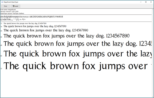
Click Install at the top left.
Installing your font on Mac
Find the font file you downloaded. It likely has a .ttf or .otf extension and it’s probably in your downloads folder. Double-click on it.
NOTE: If the font file has a .zip extension you need to open that .zip file and open the font file from there.
It will open in the Font Previewer. Click Install Font to open in Font Book.
In Font Book, drag and drop the font to Windows Office Compatible to make it available to Microsoft Office.
After you’ve installed the font, whether on Mac or PC, you need to restart PowerPoint for it to appear in your font list, ready to use.
Round two: How to avoid a personality clash
You’ve used your noggin and picked some practical choices. Now it’s time to bring in the heart.
The font you use for your PowerPoint presentation says so much more than the copy it’s used for. Fonts convey emotion, they have personalities and, when used right, they help to visually tell your brand story. After all, you wouldn’t write a formal tender document in Comic Sans, would you?
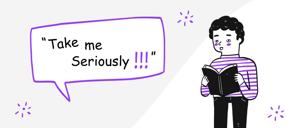
No, you’d choose something that communicates respect and integrity, such as Bodoni or Optima.
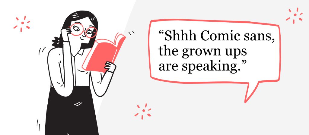
But these guys are just gatecrashers. Back to the main event.
Let’s hand over to our fonts, so you can get to know them a little better.
First up, our reliable system fonts.
Tahoma

“I’m pretty neutral. The Switzerland of fonts. My personality may not be wacky enough for some, but I’m always up to have some good, clean fun.
I go with anything, complementing whatever design style you’ve chosen, rather than trying to stamp my personality all over it.
Some call me boring, I like to think I’m agreeable. After all, is your presentation really about me?”
Verdana

“I’m a modern font with an air of innocence. Clean cut, yet retaining just enough personality to liven up your presentation, I will add a dash of character without stealing the show.
I’ve been described as “cheap”, but I prefer to think of myself as simple. I stand back to let your message shine through.”
Impact

“Want to make a statement? I’m the font for you.
My popularity hasn’t made me any less impactful.
I may be heavy and condensed in style, but I look great in all caps and am effortless to read.
Big, bold, and powerful; when you’re with me, no one in the room will be able to take their eyes off you.”
Georgia

“I may be traditional, but traditions stick around for a reason. I’m sophisticated, certain, confident and reliable. Yes, I prefer to err on the side of practicality, over flamboyance, but if you’re looking for someone to take to a formal occasion, I’m the font for you. After all, people often describe me as looking “expensive”.
With such high contrast between my weights, ample letter spacing and clever design, your message will come across, loud and clear.
Want to put some power behind your presentations? I don’t mean to brag, but my bold is significantly more bold than your average.
To put it simply: I’m a classic.”
Palatino

“Pfft. A classic? A relic, you mean. Who wants classic, when you can have modern classic?
I’m popular among professionals, as my sharp edges add a dash of character, without getting too crazy.
Originally designed for headings, I can certainly stand out from a crowd, but my open counters and carefully-weighted strokes mean I also look great as body copy.”
Phew, things are certainly heating up around here. Before you make your final choice, let’s not forget about our custom contestants.
Proxima Nova

“Now, now, please don’t be intimidated by my beauty.
I may be stunning, but I’m so much more. I have so many different weights, I might just be the most versatile font around. You can take me to any occasion, and I will adapt.
As a premium find, I don’t come cheap, but if you have a subscription to Adobe, you can get me through Adobe Fonts, at no extra cost. Consider this your lucky day.”
ITC Souvenir

“I am so in right now. By choosing me you will instantly freshen up your slides and add relevance to your designs.
I combine the traditional elegance of a serif with a so-hip-it-hurts retro 90s vibe. I’m curvy in all the right places and will catapult your presentation into the here and now, without losing the credibility that comes with a classic serif.”
Montserrat

“Hey, man.
I’m a reaaaaal solid font. A hipster classic.
If you want a font that complements your check shirt, I’m your guy.”
Raleway

“What do you need to know about me? Well, I’m thicc.
If you’re looking for something chunky and bold, look no further.
Oh, you’re not? Wait, please don’t go.
I can be sleek and thin for your text pull outs, too.
Or just a regular type for body copy.
I’m diverse and eager to please. Just let me know what you need, and I’ll find a solution for you.”
Lato

“You can’t judge a book by its cover, and you can’t presume to know a font on first glance.
To the untrained eye, I might look like any other sans serif font, but just get to know me and you’ll see my originality shine through.”
And that’s everyone. Now that you’ve met our fonts, all that’s left for us to do is ask the big question…
What’s your type?
You have everything you need to make a smart decision about the best font for your PowerPoint presentation, but your adventure together is only just beginning.
Here are some more tips to get the most out of your new beau.
Perhaps one font isn’t enough?
There are many reasons that you might want to use more than one font in a presentation, however, ain’t nobody got time to pick a pair through trial and error. That’s why you come to us for our sweet presentation design services, right?
Usually, a font with a big personality paired with a more conservative font works well. Pairing a serif with a sans serif can create a nice contrast, but remember to use the sans serif for heavy body copy, as you want it to be legible. You can have a little more fun with your header type, as this tends to be larger, with more space to breathe.
Avoid pairing types that are too similar. If they aren’t distinguishable from
each other it can look like you just made a mistake.
If you found it hard to decide which font to choose earlier, pairing two fonts is your chance to have your cake and eat it too.
Some examples of good couples are:
ITC Souvenir works really well with Roboto and Futura. Roboto and Futura are classic fonts, but they don’t come native to Microsoft Office, so they will need downloading and installing.
Alternatively, our curvaceous ITC Souvenir sits pretty as a picture next to a simple font, like Proxima Nova.
Raleway works with Playfair Display, a beautiful serif font that’s available free from Google Fonts.
Montserrat, which was designed specifically for use online, works perfectly with an old-school classic, like Courier New. The light, modern feel of Montserrat contrasts beautifully with the retro, typewriter vibe of Courier New.
Or you could pair Impact with Tahoma, or even Lato, for a perfect presentation font combo.
If you’re unsure, play it safe. Choose a typeface with lots of weight variations (like Open Sans below), and pair fonts from the same family. After all, they were created to work together. Just make sure there’s enough contrast to make the two types distinguishable.
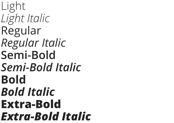
Finally, don’t go crazy with your number of fonts. You can be a little greedy and get away with it, but at some point, they’re all just going to start fighting one another for your affections. As a general rule for presentations, there should be no more than three or four variations in type, weight or effect. That means you can usually get away with two different typefaces. You can then bold, italicise or change the weight for the remaining variations.
How do my fonts look to other people?
We know what’s really important to you. It’s not whether you like your font choice, not really. You care that your message is communicated clearly and effectively to your audience, and your use of type plays a part in this. Here are a few tricks you can use to make sure the message you’re sending out into the world is the right one.
Be bold to stand out
Use italics to stress a point or to indicate a publication, such as; How to choose the best font for your PowerPoint presentation.
A lot of people like to use bold to make their key information stand out. But be careful. If you embolden too many things, what’s important gets lost in a sea of bold.
We don’t see a lot of underlines these days, do we? This is something you can use to your advantage. If you have a word or phrase that really needs some bite, throw a lone underline in there for maximum impact.
Get in line
It is really important to be consistent with your alignment choice. If your alignment jumps from left to right, to centre, back to right, the likelihood is your audience aren’t following. It makes it difficult for them to know where their eye should go, and it can make them feel pretty seasick.
Left-aligned text is the easiest to read. In the West, this is the most commonly-used alignment, as we read left to right. It also creates a clean left edge for our eyes to return back to, once we reach the end of the previous line. It’s like a typewriter, always returning to the same point.
Right-aligned text is usually used for decoration, or to accompany a logo. It’s not very easy to read when in large blocks, because your eyes have to do summersaults to find the beginning of the line again.
Centred text works for small snippets of text, such as posters and book covers. Like with right alignment, your eyes will struggle to follow from line to line, if it’s any more than a few sentences.
Justified text is generally acknowledged as a sure-fire way to create order. However, it can be difficult to get right. Justified text makes the words fit a pre-determined line length, by changing the distance between each word. This means each line has a sharp, consistent edge, but can create big white spaces between words called ‘rivers. Justified text can be particularly difficult for people with dyslexia to read, as the ‘rivers’ distract from the actual text.
Optimise your copy
The optimum line length for presentation copy is 50 characters. This allows the eye to keep track of where the next line starts, so the jump back is seamless.
One of the biggest peeves when it comes to working with typography in presentations is untidy sentence endings. We’re not talking about ending with a preposition, it’s only really dull people that care about that. We’re referring to how a body of text is shaped.
Avoid raggedy paragraph structures, which cause your, otherwise beautiful, design to look untidy and unfinished.
If you’re using left-aligned text, look out for any big gaps or words that hang off the end of the line. Try using a soft return to move them around, as this creates less space between lines than a hard return and notifies the brain that you’re still within the same paragraph.
The lonely hearts club
This is all great advice, until you add in the complication of widows and orphans.
A widow is a lonely word with a line all to itself. You can fix this with that soft return trick, knocking a word or two down from the line above. Your widow won’t be so lonely anymore.
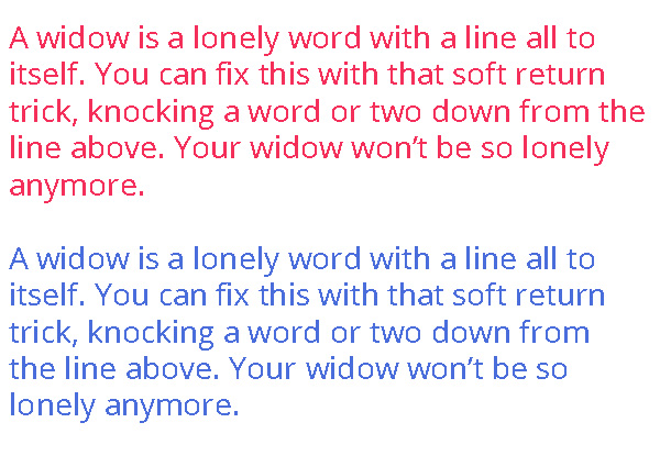
An orphan is when that single word, or a single line, causes you to have to start a new column, or a new slide entirely. Again, either editing your copy or adjusting the structure of the whole paragraph will fix this.
Try to strike a balance between the perfect paragraph shape, and removing your widows and orphans. If you have to make the call, it’s better to have a ragged line than a widow.
Not enough information for you?
As you can see, when working to plan your idyllic future with your new partner in presentations, there’s quite a lot to get your head around. For more tips on creating beautiful slides, check out our presentation design cheat sheet, explore more system font choices with our comprehensive overview of what’s available, or get in touch to set up your very own, exclusive episode of What’s your type?


