
When clients ask us for guidance on crafting presentation content, one of the blanket pieces of advice we give is to keep it simple. Minimal slide copy, minimal design and minimal animation. Simplicity works. It drives engagement, reduces the potential for distractions and encourages the audience to focus on the speaker. For speakers who have a lot to say, this can be quite a challenge.
What is a PechaKucha presentation?
PechaKucha has taken the idea of short and sweet to the next level. Taking inspiration from the Haiku, PechaKucha is all about sharing ideas in a succinct, straight to the point style. No bullshit, no corporate waffle and no superfluous language. Just the juiciest bits.
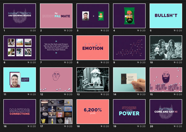
Born in Japan, PechaKucha evenings are informal, intimate gatherings where people have a platform to speak about a topic they’re passionate about. Some talk about their latest projects, some share an experience that shaped their lives and some chat about their recent holiday. The subject matter is broad, but the format is restricted. The common denominator of all PechaKucha presentations is the simple 20×20 system. 20 images for 20 seconds each. That’s six minutes and forty seconds to work with.
This unique style of presenting has shot PechaKucha to stardom in the presentation world. Today, PechaKucha nights happen in over 1000 cities. Tickets go like hot cakes, and it has a fanbase that attracts loyal attendees. People are drawn to PechaKucha. The bitesize presentation format is different and enticing. The overall vibe of the events is laid back and lively. Everyone’s there because they want to be, not because they’re obliged to be.
But perhaps the most defining hallmark of PechaKucha is that the style eliminates the potential for long, lecture-style presentations. Stripping back the material the audience has to absorb is a driving force for engagement, so you won’t find anyone nodding off or checking their phones out of boredom.
While PechaKucha is beloved by audiences and speakers alike, speakers draw the short straw. They’re tasked with synthesising their ideas into 20, image-led slides and they’ve only got 20 seconds to get their key messages across before the next slide comes on. Condensing your thoughts into such a short time frame and figuring out the best way to visualise these ideas takes some serious skill. Since we pride ourselves on knowing a thing or two about storytelling and design, we thought we’d have a go. Challenge accepted.
Buffalo 7 at PechaKucha Manchester
Our very own Communications Director, Chris Tomlin was put to the test. A natural writer and communicator, Chris has storyboarded, written and produced a wealth of presentation material for some big brands, but PechaKucha posed a refreshingly unique challenge for him to sink his teeth into.
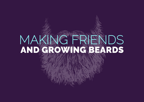
His story had three central themes: beards, storytelling and charity.
Chris was already growing a beard to raise money for charity and he knew off the bat that he wanted to bring a philanthropic dimension to his talk.
The theme of the night was “building connections”, so he spoke about the link between stories and meeting new people. Specifically, how stories have the power to make us feel, understand and communicate.
Drawing inspiration from his own experience of using a personal story to encourage donations for a bowel cancer charity, Chris skilfully connected the dots between beards, storytelling and charity. The result was a compelling case for storytelling.
But PechaKucha isn’t just about sharing stories, it’s got even stronger ties to the design industry. The best PechaKucha pieces weave beautiful imagery and spoken word together to create a memorable and meaningful experience. Every slide, image and word counts. Every action you take adds seconds to the automated timer. While Chris had the spoken word part down, he’s no designer. We had to bring in the Tyson.
PechaKucha presentation design
Hannah Tyson is one of the treasured Senior Designers at our presentation agency and happens to be a PechaKucha fangirl. She was tasked with visualising Chris’s words. Her designs captured the tone of PechaKucha perfectly: they were simple, fun and light hearted. We wanted to make the audience laugh and keep the genial atmosphere going. She struck a charming balance of photography, graphics, typography and quotes; all of which served to fittingly visualise the spoken words.
Both media (design and content) worked together beautifully. Chris put forward a captivating argument in support of the power of storytelling and his talk ended with rapturous applause. Overall, PechaKucha gave us a new challenge to take on and both Chris and Hannah took it in their stride. On to the next one.
So what can we all learn from this?
Firstly, that simplicity is a valuable tool in any presentation arsenal. Keep it minimal, and your audience will appreciate and understand your messaging more.
Next, that storytelling is a great way to bond with your audience and make complex data easier to understand.
And also that great design can bring a presentation to life, supporting you as a presenter and helping to make your messages hit home.
Another fundamental part of the PechaKucha experience is practice. To get the timing right, talking for exactly 20 seconds before the next slide appears is tough. Telling your story and hitting your mark for all 20 slides, without leaving awkward pauses or rambling into the next slide takes discipline.
No ad libs, no ‘erms’, just a polished script that needs to be delivered in front of friends, family and the mirror – again and again – before the big night.
So go on – challenge yourself! Find your local PechaKucha and tell your story.

