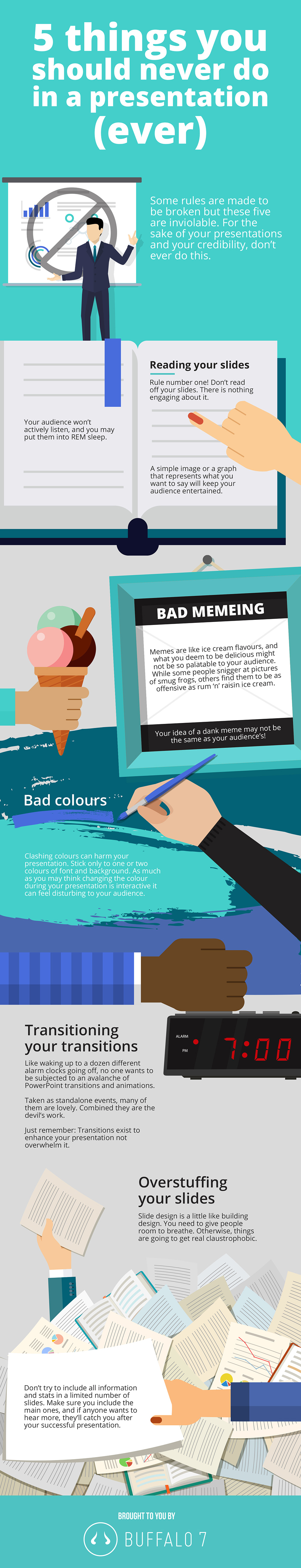
Some rules are made to be broken but these five are inviolable. For the sake of your PowerPoint presentations and your credibility, don’t ever do this.
When Meatloaf sang that he would do anything for love “but I won’t do that”, he was referring to using Comic Sans in a PowerPoint presentation. That cardinal sin doesn’t make it into our top five don’ts because you’re smart enough to know not to use comic sans – unless you’re using it ironically, in which case go wild.
Here at Buffalo 7, we like to think of ourselves as optimists; for us the glass is always half-full, and if it that ever looks like changing, we simply order another one. But we’re not here to talk about our drinking or our cheerful disposition: we’re here to talk about things you should never do during a PowerPoint presentation. We don’t like to dwell on negatives – that’s not our style – but just this one time, indulge us. If it prevents these errors from creeping into your presentations, we’ll be doing you and your audience a favour.
Reading your slides
This appears to be top of most people’s presentation hates, and we’re gonna go elevate it to the forefront of ours. Imagine going on a date where you read your smalltalk off cue cards. Now imagine sitting through a presentation where the same thing happened. We don’t need to imagine, cos it’s happened to us, and at the time we vowed never to sit through another PowerPoint recital again. That’s why we’re urging you politely: please don’t read off your slides; if you’re gonna do that you’d be as well to email them to us and save everyone the bother of having to leave the office. Talk to us instead and use your slides as a prompt. Trust us, it works way better.
Bad memeing
Okay, so this pet hate probably isn’t going to feature on too many other people’s lists, but it’s going on ours. Here at Buffalo 7, we’re big fans of memes; like the rest of the internet, we’re addicted to them. Which memes? Why the good ones. The sort that make you laugh out loud and instantly forward them to all your mates. But memes are like ice cream flavours, and what you deem to be delicious might not be so palatable to your audience. While some people snigger at pictures of smug frogs, others find them to be as offensive as rum ‘n’ raisin ice cream. What’s wrong with rum ‘n’ raisin you say? See, there’s our point: your idea of a dank meme may not be the same as your audience’s. This doesn’t just apply to internet memes incidentally, but to attempts at humour in general; if you’re gonna do it, you need to nail it, otherwise there’ll be facepalms all round.
Bad colours
We can’t decide what’s worst, bad colour choices, bad images or ClipArt (which is bad, period), so we’re going to sneakily lump them all into this section. Let’s focus on the most egregious though: clashing colours. Bad colour choices hurt. Like, literally. (And we’re not just saying literally metaphorically.) There’s no shame in being something of a rookie when it comes to recognising colours that complement one another; some men go through life labouring under the misconception that there are only three colours, red, yellow and blue. If you’re the sort of person who struggles to pair their socks, let alone their colours, check out this piece we did on free PowerPoint resources.
Transitioning your transitions
“Yo dawg, we heard you like transitions so we put a transition in your transition so you can transition while you transition”. What’s your favourite PowerPoint transition – wipe; split; origami; fly through? If you can’t decide, why not link a few together so you can impress your audience with your detailed knowledge of PowerPoint? Er…how about no. Like waking up to a dozen different alarm clocks going off, no one wants to be subjected to an avalanche of PowerPoint transitions and animations. Taken as standalone events, many of them are lovely. Combined, they are the devil’s work. Like a web browser full of toolbars or a phone lock screen full of notifications, multiple transitions are a hideous thing. If you’re wanting to enhance your presentation rather than overwhelm it, check out this guide on transitions we published only last month.
Overstuffing your slides

We get it, you’ve got a lot of important information to convey and only so many slides in which to convey it because you’re mindful of our exhortation last week not to use too many slides. Don’t take this as justification however to squeeze in all your content using teeny tiny typefaces and reducing the margins to zero. Slide design is a little like building design: you need to give people room to breathe. Otherwise, things are going to get real claustrophobic, real fast. Also, it’s kinda hard to read.
Do you know anyone who’s guilty of committing one of these sins? If so, don’t shame them: just send them this article with a snappy one-liner such as “I loled”. They’ll read it and they’ll learn never to do it again.